The term “safety color” is used to describe the regulated or best practice method use of colors for safety purposes in the workplace. There are many standards in place concerning the proper use of safety colors from a variety of organizations, including OSHA and ANSI.
While there are many organizations and agencies that assign safety colors different meanings, a lot of them have significant overlap. This is done intentionally to help ensure standards apply across as wide a range of situations as possible.
OSHA Safety Colors Defined
Businesses are required to follow OSHA regulations to keep their employees safe from a variety of hazards in numerous different environments. In fact, the Occupational Safety and Health Administration has several requirements about signage colors that should be used to improve safety and decrease accidents.
Companies that familiarize themselves with the different sets of criteria OSHA provides can help facilities learn how to properly use safety colors, which will not only improve workplace safety, but will also help them stay in compliance with OSHA guidelines. This is because each color in a code-compliant and visually communicative facility is assigned a different meaning.

These color-coded signs and markings allow people to immediately determine the type of safety hazard in the area, even if they are too far away to read any actual writing.
Basic Color-Coding Requirements from OSHA
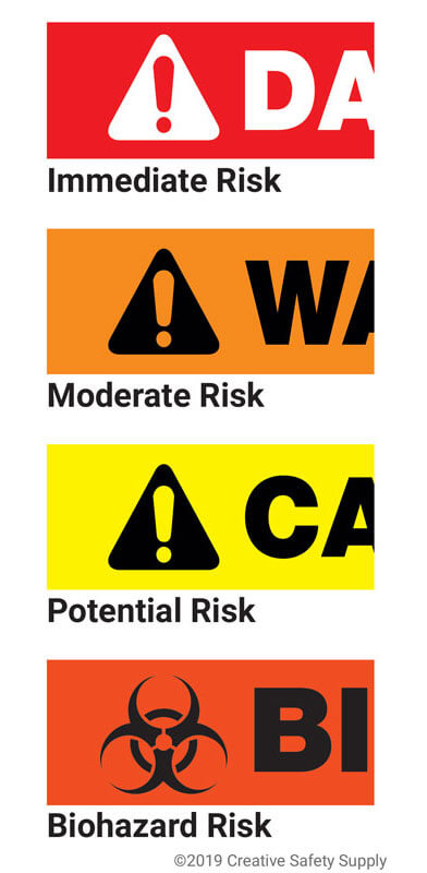
The first set of safety colors issued by OSHA covers a broad category of hazards that exist in facilities, and how people should be warned about them. There are four main types of warning language used for this set of standards:
- Danger – Danger signs are only used when there is an immediate risk to the life and health of an employee. OSHA requires these signs to be red or predominantly red. Any lettering or symbols must be a contrasting color to ensure maximum visibility and bring attention to the hazard.
- Warning – The warning category is for when there is a risk, but it is not as severe or immediate as when danger is used. The safety color associated with warning is orange or predominantly orange. As with the red, any lettering or symbols must be a contrasting color.
- Caution – This category is for alerting people to a potential risk. Caution signs must use the color yellow.
- Biological Hazards – Biohazard dangers have gotten their own category because of the unique risks they present. When issuing a safety alert about biohazards, the color to use is fluorescent orange or an orange-red color.
OSHA Safety Color Code for Marking Physical Hazards
OSHA requires facilities to follow 1910.144 - Safety color code for marking physical hazards. Here, there are just two colors covered for physical hazards:
- Red – Red should be used when there is a fire-related hazard in an area. This includes areas near open flames as well as flammable materials that could ignite or explode. Red can also be used to alert people to stop, which is essential for indoor or outdoor driving and other situations.
- Yellow – The color yellow is used for hazards related to striking, falling, slipping, tripping, pinch points, and other similar hazards that are common in many manufacturing or warehouse facilities.
Notice the colors in this category overlap those in the previous category. In most situations, it is possible to have the meaning of the safety color apply in both situations. A fire risk, for example, will be red both because it is a fire hazard and because it represents a significant danger to the facility and all employees.

ANSI Safety Colors
Another major organization that provides safety color recommendations is the American National Standards Institute. ANSI is not a governmental organization and therefore has no enforcement abilities like OSHA does. Despite this fact, however, ANSI's color-coding standard is generally followed throughout the country and even in many places around the world.
This is because the ANSI standards, including those that apply to safety colors, are recognized as some of the best safety measures globally. In fact, many of OSHA's color standards are drawn from the ANSI system.
ANSI Safety Color Meanings
By adhering to the ANSI Z535.1 code, the facility’s employees will have a chance to keep themselves accountable for safe behavior. Instantly recognizable color patterns are hard to miss, and so are their prescribed meanings. The following is a list of ANSI colors and their meanings:
- Red – The color red is used on any safety signs, labels, or other objects to signify danger or to alert people that they need to stop.
- Orange – The color orange is used to alert people of dangerous parts on a machine or piece of equipment. The danger could be from a crush, cut, shock hazard, or any other hazard that could physically harm people or the facility. These warning postings are most used on labels in reference to machinery but could also be used on signs and other objects.
- Yellow – Anywhere that caution needs to be used, yellow should be the primary color on the signs or labels. Like OSHA, this includes risks of tripping, falling, getting burned, being caught in a pinch point, experiencing hearing damage, and almost any other common hazard that may be present.
- Green – The color green is used to alert people to the presence of an emergency egress. This provides directions for those needing to escape areas during emergency events. Another place where green is used according to ANSI is to identify where first aid and other types of safety equipment are kept.
- Blue – The color blue is used on signs and labels that provide information and suggestions about a particular item or location. This information doesn't necessarily have to be safety related.
- Black & White – A black and white sign or label is used for guiding traffic or telling people which direction to go. These colors can also be for housekeeping practices in the facility. While not specifically safety related, having this type of signage can directly improve the safety of the facility.
- Purple – The color purple is reserved by ANSI for future use, but it has become a de facto standard for radiation hazards through popular use.
- Gray – The color gray is reserved for future use by ANSI.
These basic colors are excellent at alerting workers of any dangerous hazards present in the facility. On top of increasing awareness, these signs also give employees the information they need to protect themselves in the presence of danger. Visual communication may assist in enforcing PPE rules, workplace manufacturing protocol, and even prevent unauthorized employees from entering a restricted space.

ANSI Pipe Color Code Markings
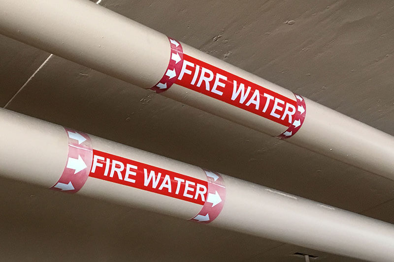
Pipe markings are another visual communication resource required by OSHA. By adopting ANSI’s standard color codes for pipe labeling, employees and emergency responders will be able to identify a pipe’s contents. This is incredibly important because it is almost impossible to know exactly what a pipe contains unless it is labeled.
ANSI has established the following safety colors specifically for pipe labels:
- Yellow – The color yellow is used for flammable liquids or gases.
- Brown – The color brown is used for any combustible liquids or gases.
- Orange –The color orange is for toxic and/or corrosive solutions.
- Red – The color red is for fire-quenching liquids or solutions.
- Green – The color green is used to label water pipes. Note that this can be water used for coolant, waste, or other things, so it is not necessarily potable.
- Blue – The color blue is used for compressed air.
These safety colors for pipe markings are important to remember, especially if an industrial label maker is used to create labels in the facility.
Where Should Safety Colors Be Used?
A facility should use safety colors anywhere they have been deemed necessary to protect workers or are required by law. In most cases, however, there are common ways these colors are used across multiple facilities, and even in multiple industries.
One of the best ways to ensure a facility gets the best benefits from safety colors is to learn from the proven strategies of other companies. The following sections discuss some great ways to apply safety colors in any facility.
Implementing Safety Colors in Your Facility
Once a safety manager knows which colors to use where from the standards and regulations they have read, it is important to learn the best procedures for adding those colors to an area.

There is always more than one way to improve visual safety, and the best solution depends on the unique situation of the company. Taking the time to evaluate a facility and choose the best method ensures these safety colors are easily visible and that they stay in place for a long period of time.
- Labels – Safety labels are very common in most facilities. These labels can be ordered pre-printed, or custom made in a facility with an industrial label printer. One important thing to remember when creating custom labels is to ensure the proper shade of a color is used so people aren't confused about the safety message being conveyed. Consistency is key!
- Signs – Safety signs are found in virtually every facility. These signs can be made by applying labels to sign backings or by ordering custom signs that are on metal or other materials. Signs are typically larger than labels and are easier to see from most places in the facility.
- Floor Marking Tape – A facility can quickly convey a lot of information quickly with the help of floor marking tape. For example, areas where there are fire hazards may be marked with red floor marking tape. This is an easy and affordable way to convey a clear message throughout a facility.
- Floor Marking Paint – Like floor marking tape, this paint can come in any color and will convey a clear message all without wording.
- Posters - Putting up posters in the facility is another way to convey a safety message. Some facilities even install posters that identify the specific safety colors and what each design means as a reminder to employees.
Before purchasing any visual communication, do your research. What do you want to achieve in your environment? Is it fewer falls, spills, or fires? Next, look at what you are required to do by law. Asking these questions is essential for building a robust visual communication strategy.
Safety Colors for Visibility
Safety colors are widely used in facilities and their use is often mandated by industry regulations. Just because companies are often told how and when to use safety colors, however, does not mean they can't come up with their own unique uses. Many workplaces have found that the proper use of color can help dramatically improve the visibility of signs.

Conveying information to people using visual communications is very important in the often-loud environments of the workplace. While normal black text or letters on a white background is fine for some situations, others can benefit from color to add different levels of contrast and improve visibility.
It is even possible to get glow-in-the-dark printed signs that will be visible during a power outage. Taking the time to figure out which color combinations are the most visible in a facility is worth the effort.
However, we must emphasize that you must make sure to avoid using the already established safety colors listed above for anything other than their designated uses.
Training Employees to Recognize Safety Color Meanings
One of the biggest benefits of following standards when it comes to safety colors is that people will often know what the colors mean, even without training or instructions. A new employee who joins a facility from another company may already know what colors mean in which situation, which can help keep them safe during their initial weeks on the job.
Just because almost all facilities follow these standards, however, does not mean that a company is able to skip or delay training. All new employees should be given detailed training about what the safety colors are and what they mean in all the situations that apply to the facility. This should be done within the first few days of employment.
Even seasoned employees should be trained on safety colors and signal words. All employees should be updated whenever there is a change in the colors and elements used or where they are used. This can be done through a formal training session or just a meeting with a supervisor.
No matter how it is done, it is the employer's responsibility to ensure all employees are up to date with the latest safety colors. This will not only keep the employees and facility safe, but it will also help avoid any risk of being out of compliance with OSHA regulations.


